The quality of life as we age becomes a critical concern in a time defined by a remarkable lifespan. The shift from simply living to a healthy, meaningful existence is still unclear even with the tremendous progress made in healthcare. A major increase in Canadian life expectancy was reported in a 2018 World Health Organization report, highlighting the need to close the gap between longevity and health span—the amount of time spent free from chronic illness or aging.
Thanks to universal technologies, there is a chance to close this gap by enabling older people to live more autonomous, engaged, and social lives. The problems of designing for the elderly are distinct. This group has varied levels of physical and cognitive ability as well as a variety of technological skills, despite their increasing familiarity with mobile devices. The increase in older people using smartphones highlights how open they are to new technology and highlights the right time to take use of mobile and accessible technology to meet their changing demands.
The COVID-19 pandemic's rise emphasizes how urgent it is to provide elderly people with creative solutions. Seniors' isolation is made worse by social distancing policies, thus there is an urgent need for digital interventions that support mental and physical health, encourage social interactions, and give them access to essential resources.
We will create an application that will improve senior users’ physical and mental health, regardless of whether they live at home or in a nursing home.
Our task is to create a user-friendly and powerful application that serves the many needs of this group, especially in relation to social distancing policies and self-quarantine guidelines.
We will start a full UX/UI design approach with a deep understanding of the problem scenario in order to accomplish this goal. We will examine current solutions through investigating and analysis, collect data from user interviews, and create personas and user experiences. Our study procedures will be determined by ethical concerns, guaranteeing the integrity and welfare of our subjects all along every step of the way.
Our app will provide features such as:
We will create and prototype the application using a variety of design elements, such as style guides, wireframes, and sketches, based on the results of our study. Our goal will be to develop a visually appealing prototype that balances the demands and preferences of older users with a focus on the user experience.
Designing software for the elderly is a challenging and important task, as the older population is growing rapidly and has diverse needs and preferences. To design an app that seniors will love, it is necessary to understand the physical and mental changes that affect their interaction with technology, such as vision loss, hearing impairment, and digital literacy. Firstly, we did market research looking over existing apps and software that offer similar features, by doing so we learned about features that are missing and what features need to be improved. Secondly, we have conducted user interviews with elderly people to gather insights into their daily lives, challenges, and desires and to involve them in our design process and get feedback directly from them. Lastly, we created user personas that put in consideration factors such as physical limitations, cognitive abilities, and technological familiarity of our expected user base of elderly people.
A solid basis of background research forms the basis of our effort as we set out to build an application specifically for the well-being of senior users. It is imperative that we comprehend the current state of existing apps, market trends, and user preferences in order to make informed design decisions. Every choice we make is supported by insights derived from a thorough study of relevant applications, and a profound comprehension of the requirements and behaviors of our intended customer base due to our commitment to evidence-based design. After some research we would like to share some advantages and disadvantages of these applications:
Pill Reminder: A daily text message reminder to take the appropriate medication at the appropriate time is sent by this useful software.
Medisafe Medication Management: is a full of features application made to assist customers in effectively managing their prescription schedules. It provides a number of functionality to help users' health requirements, including health monitors, prescription reminders, and the ability to contact caregivers.
The 71-year-old retired accountant, Mrs. Suha, resides alone in her suburban house. Even though she is no longer close to the majority of her family, she is still hopeful about keeping in touch and remaining healthy.
Quote: Mrs. Suha: “In addition to food, my fridge serves as a convenient place to store family photos and my list of medications.”
Mr. Bashar, a 80-year-old retired business man, lives in a nursing facility where he gets frequent support and care. He is still committed to keeping up his relationships with his family and his health despite his constraints.
Quote: Mr. Bashar: “One day at a time, I'm able to maintain my activity level and connection thanks to the nurse's advice and assistance.”
Mrs. Daad, a retired schoolteacher of 85 years old, lives alone in her suburban house. She likes to spend time with her family and keeps her daily activities and health under control with a basic schedule.
Quote: Mrs. Daad: “The alarms set by my granddaughter are my only hope of remembering to take my meds.”
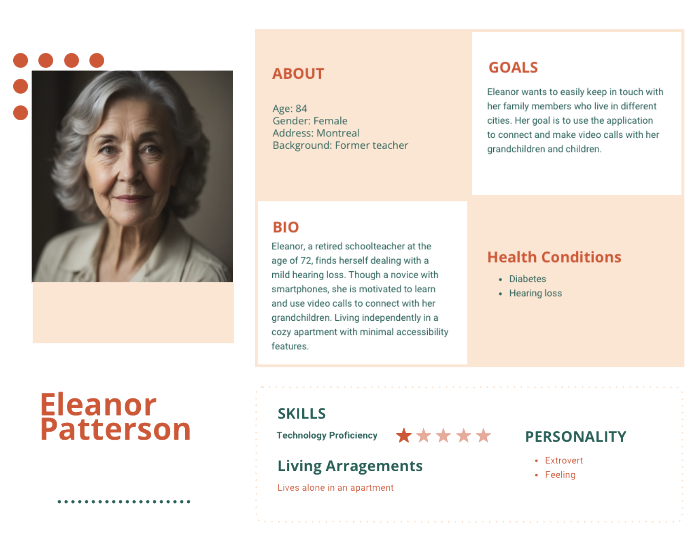
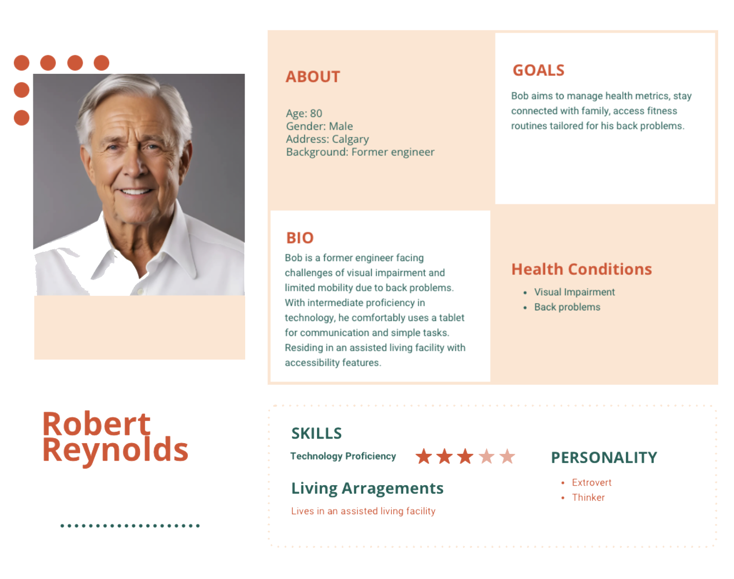
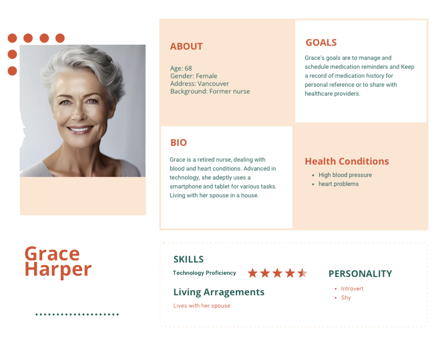
We outlined the logic process of a typical elderly person who would deal with the existing situation and search for an alternative.

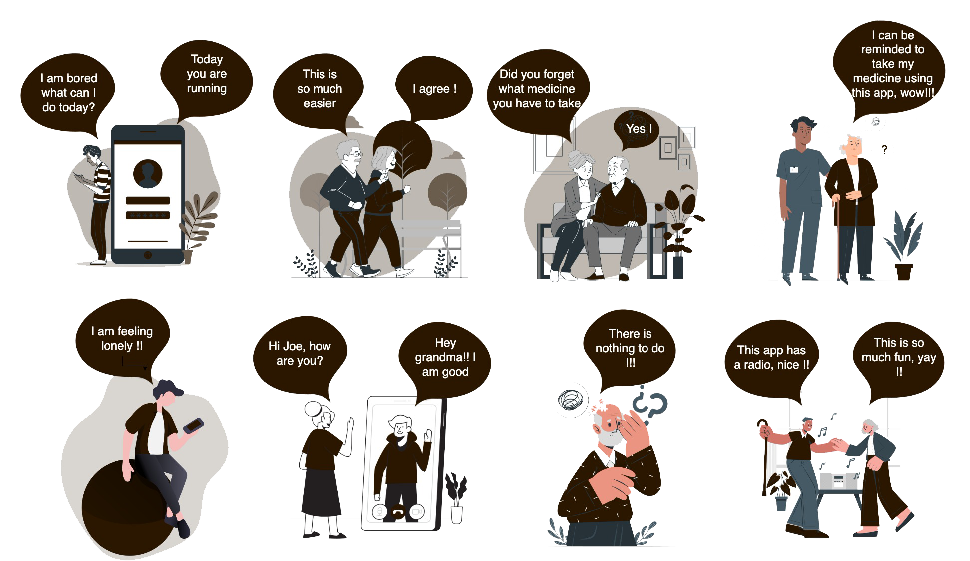
To illustrate how a user would interact with our application, we have developed a storyboard as an essential phase in the app development process. With the help of this storyboard, we can predict the emotional context around the user experience, which is an essential element in our human-centered design process. We are able to obtain important insights into how our app can best meet the needs of our senior users by visually mapping out different scenarios. This allows us to make sure that everyone has a seamless and enjoyable experience.
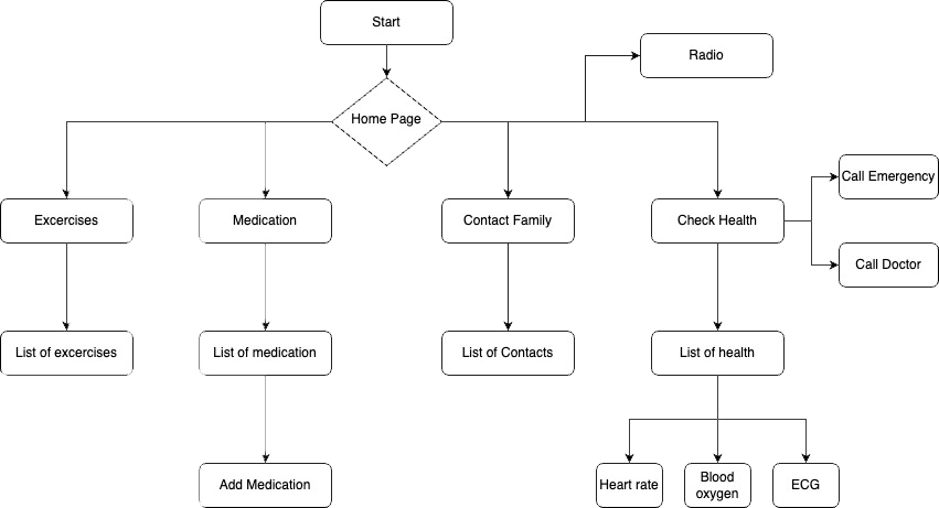
The user flow diagram represents a fundamental blueprint for our application's development. It captures the routes that users take to easily complete their goals. Through outlining the critical processes and interactions that take place within the system, we are able to obtain a thorough understanding of the user experience environment. By having a clear understanding of the user journey, we can better improve and optimize user interactions, resulting in a fluid and user-friendly interface that makes it easy for users to accomplish their goals.
As we move from inspiration to physical design, sketches serve as the blank canvas on which our ideas are produced. These are the first creative concepts that capture the essence of our idea for the app's interface, using the user flow as our guide.
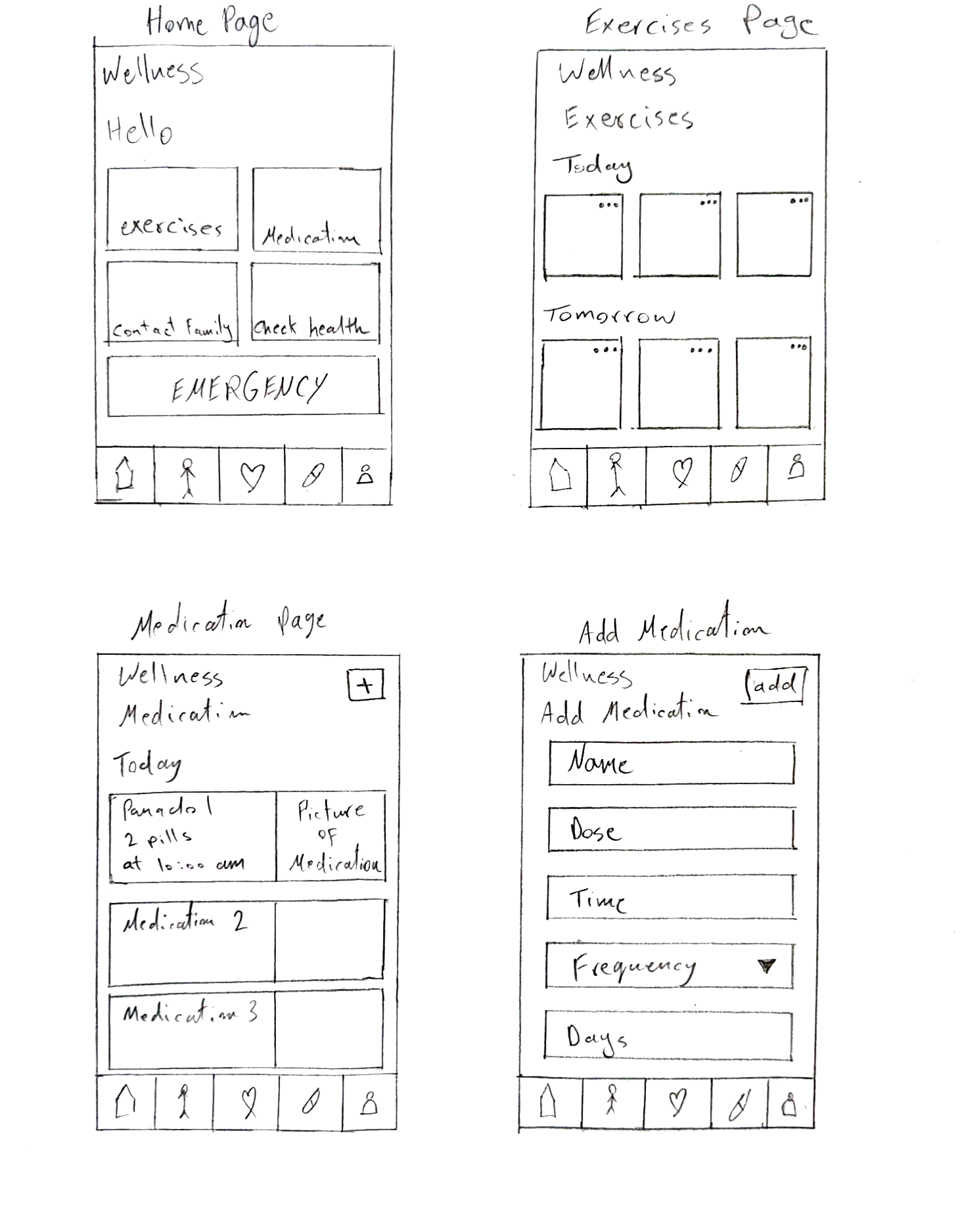
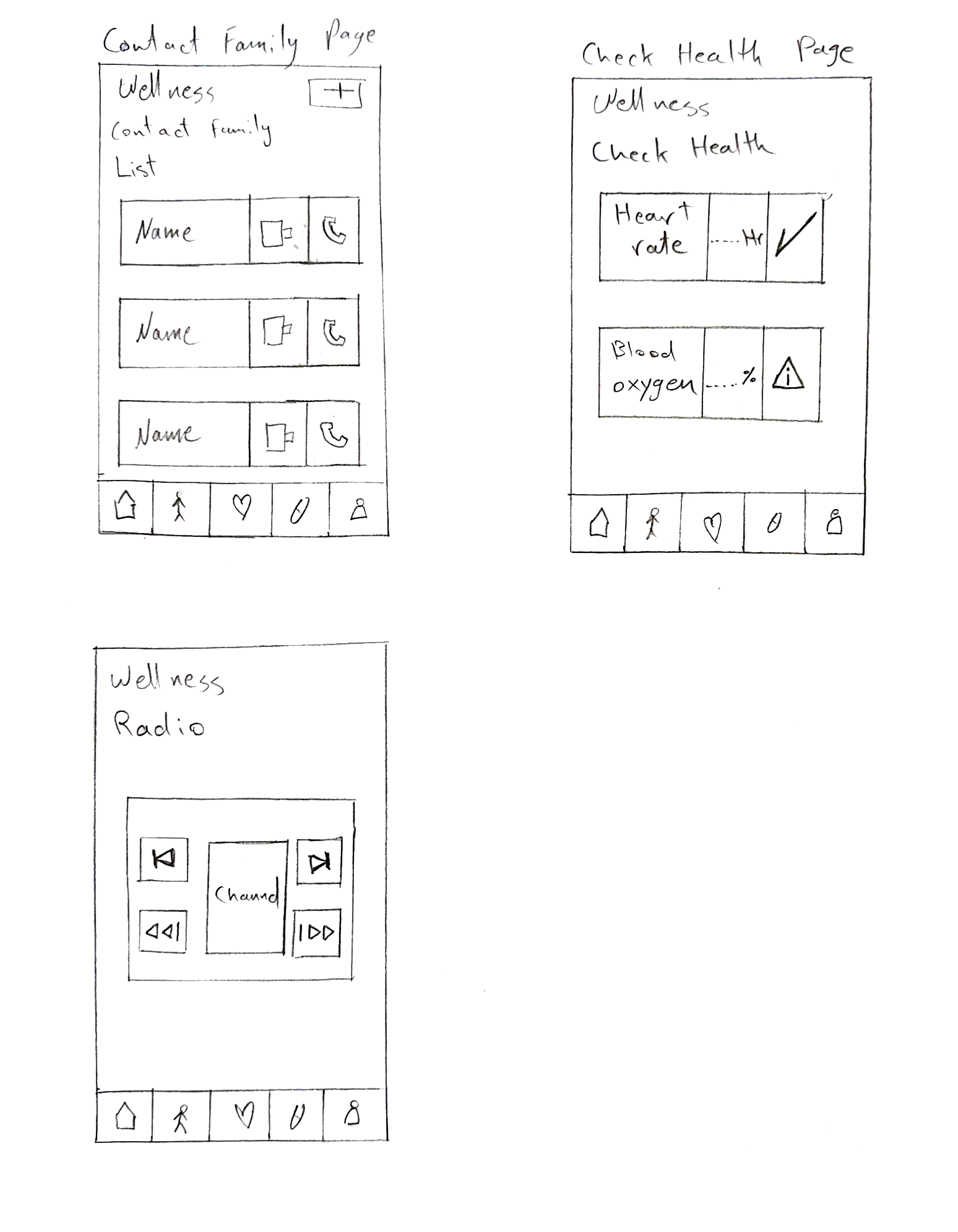
Expanding on the initial sketches, we now concentrate on creating wireframes that function as the basic structure for the user interface of our application. These wireframes, which move from informal sketches to more organized visuals, exhibit a higher degree of accuracy and precision as they carefully detail the layout, structure, and functionality of each screen.
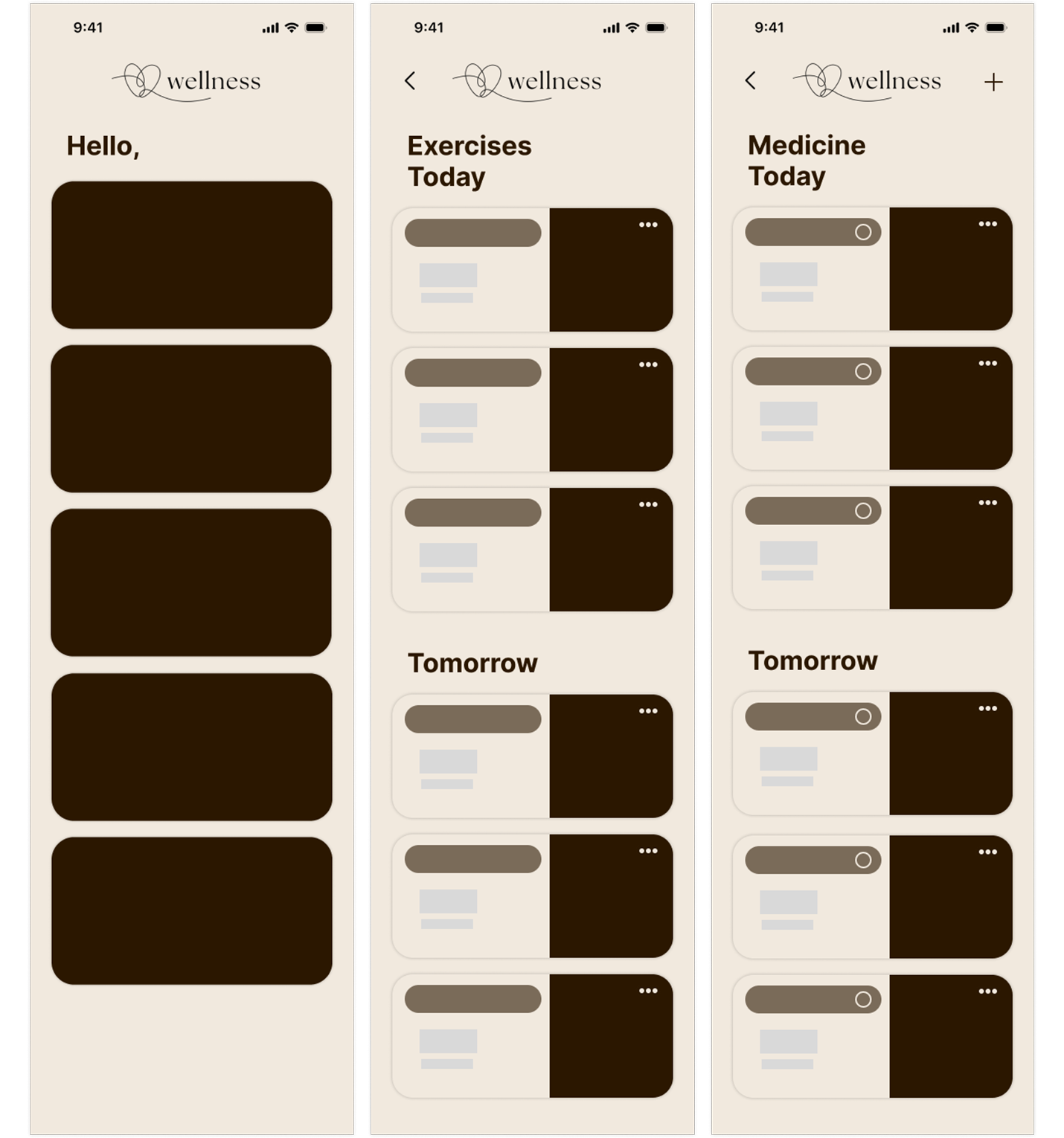
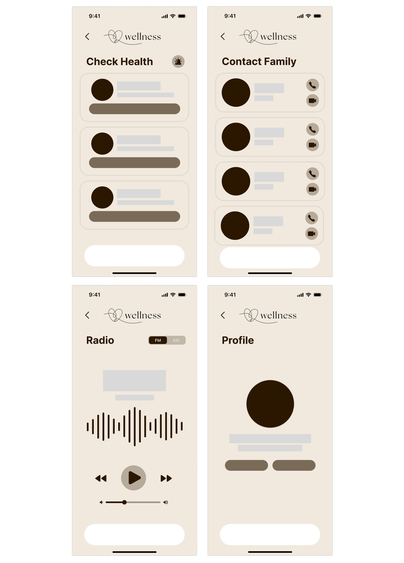
We've taken into account the particular requirements of our senior audience in order to improve our app's readability and user experience. Studies have indicated that elderly people find it simpler to look at black, beige and brownish colors because the contrast between them creates strong contrast and reduces headaches and eye fatigue. On the other hand, light-colored lettering against dark backgrounds might be exhausting, especially for older people.
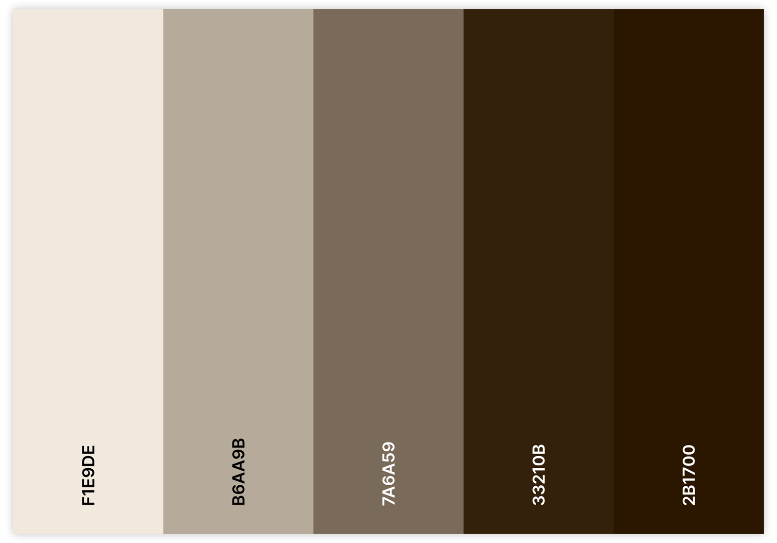
We selected a lot of brownish to beige colors in your app because of their natural ability to evoke feelings of stability, comfort, and earthiness. These colors provide the app a sense of stability and robustness, which gives our users a sense of confidence and safety. Their simplicity and conservative nature provide a rustic charm and timeless appeal, while the soft, relaxing tones create a pleasant and inviting atmosphere. By employing these colors, we create a calming and pleasant environment that enhances elderly people's pleasure and trust by encouraging a personable and approachable user experience in addition to dependability.
To improve consistency, a single font (Inter) was used for all of the app's features and modules. The font "Inter" is essential for enhancing usability—especially for older users. It's simple to read characters that are made to be clear and readable, which helps to ease the strain on aging eyes. Because of the typeface's well-balanced proportions and spacing, senior users can easily browse the interface and obtain information without feeling annoyed.
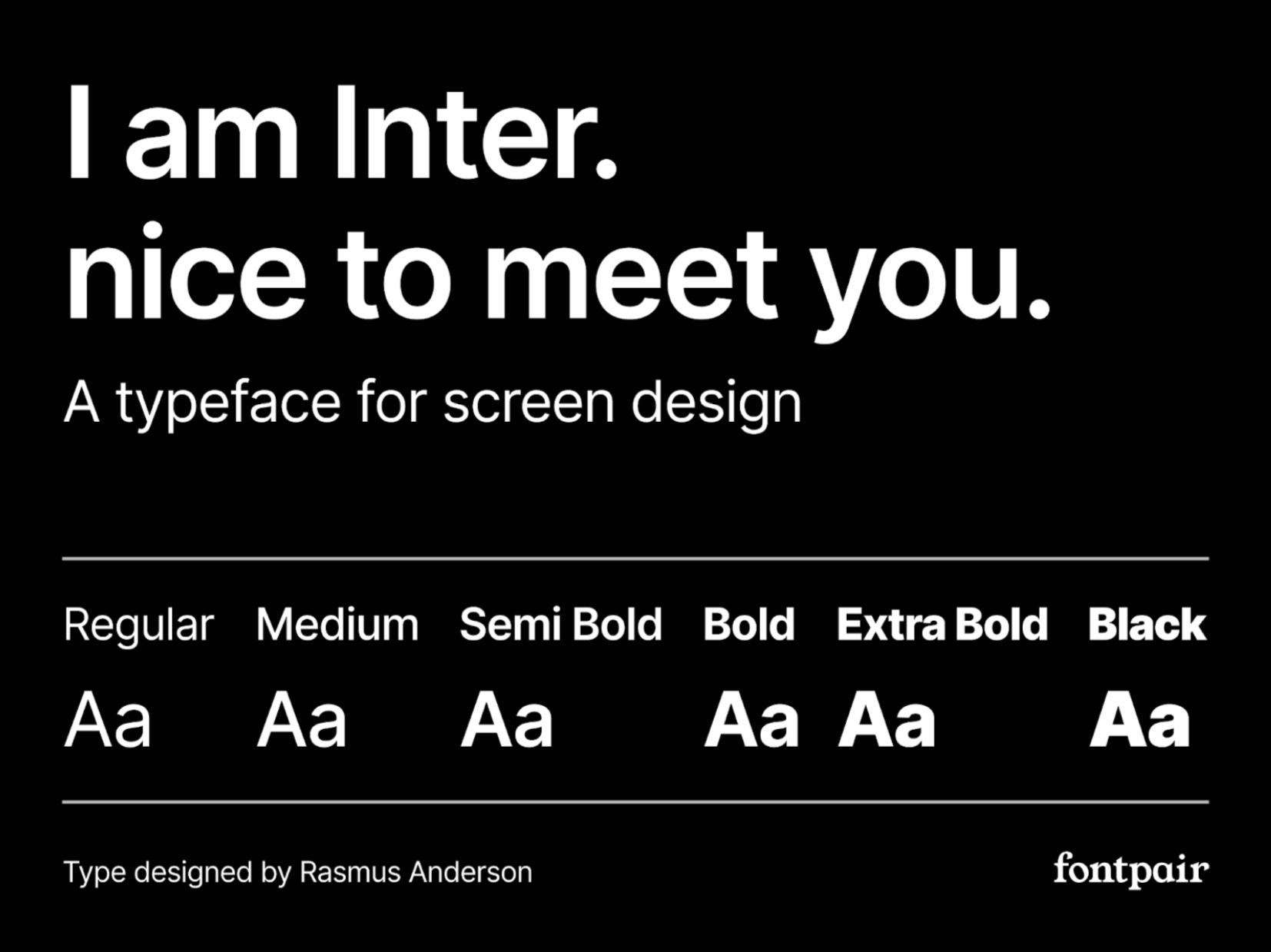
The fact that "Inter" has multiple weight options also lets us customize the font size to suit our own preferences, which improves accessibility for older users who might need larger text to read comfortably. We prioritize equality and make sure that senior users may interact with our platform efficiently by integrating "Inter'' into our application design.
Our logo was carefully designed to include a classic symbol—a heart. This decision reflects our deep concern to the older people who depend on our app for their well-being and goes beyond just aesthetics. The heart represents not just physical health but also mental and emotional well-being, which reflects our complete approach to healthcare.
For our users, our application, which is simply called "Wellness," acts as a guiding light and source of support. In a world that is frequently noisy and distracting, Wellness offers a calm place where people can find comfort, support, and company anytime they need it. Our logo has a heart, which represents warmth and compassion. We are here to provide a nurturing presence, making sure users feel supported and cared for throughout their health journey.
Our logo's simplicity highlights our dedication to providing easily accessible health care. With Wellness, we want to give our users the confidence to put their health first, knowing that they have a reliable partner at their side who will support them every step of the way.
Our app is designed to be as simple as possible, especially for elderly users. We've removed the need for login or signup pages to eliminate any barriers to entry. Instead, we made the app sync with cloud services such as iCloud so that app data can be easily transferred from a device to another without a signup/login process. When a user opens the app, they are sent directly to the home page, where they can quickly and easily access all of the features without having to take any more action.
Users are welcomed to the app's homepage, which is simple to use and intuitively built. Large buttons for each of the features—exercise, medication, check health, contact family, and radio—are part of the clear, straightforward layout. This uncomplicated approach guarantees that users may easily and quickly find what they're looking for.
Our app's feature pages have all been thoughtfully designed to meet the requirements of senior users. Since we recognize the value of simplicity and usability, every function is presented in a straightforward way. Users can easily access these features to track exercise routines, manage medication schedules, check health vitals, stay in touch with family members, or listen to radio entertainment. Accessibility is given top priority in the design, so even our older users can easily interact with the app's features.
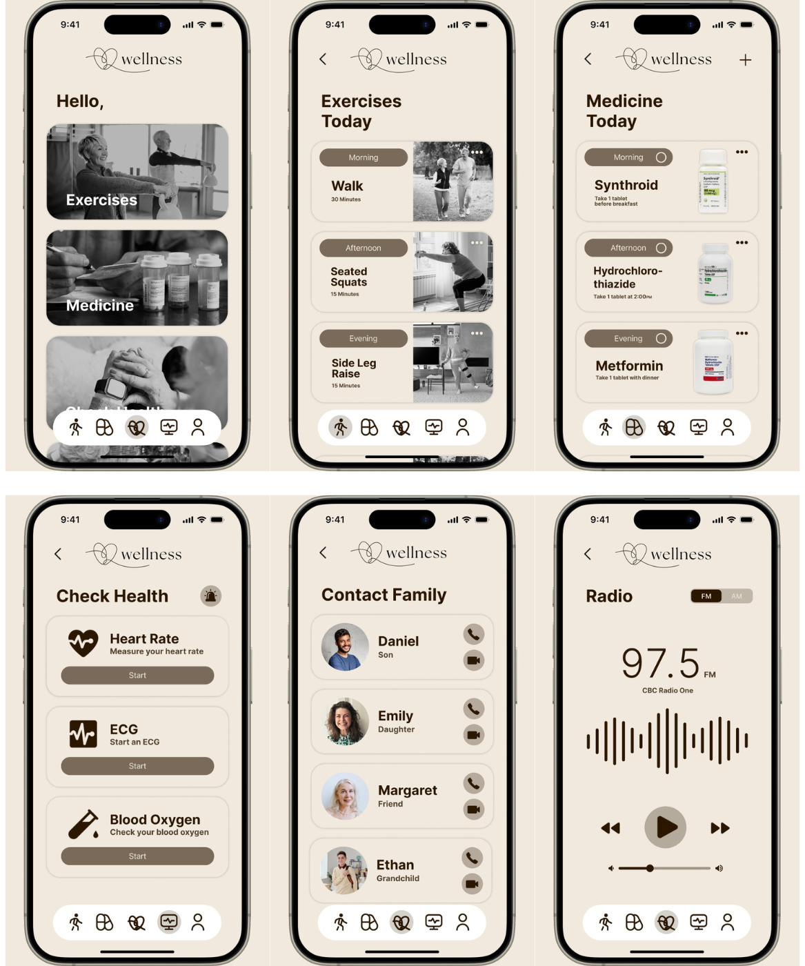
In addition, we added interactions in each page for examle, in the exercises page users are able to tap on the three dots at the top of each exercise to delete entirely or skip exercise. In the medicine page, users are also able to tap on the three dots to adjust or skip medicine dose and tap on the plus on the top right to add a new medicine, they are also able to tap the circle to set the medicine as taken. In the check health page users are able to tap on the emergency button on the top right to call emergency services or call their doctor.
To see how the prototype works interns of design and functionality, we created this video demonstration.
In conclusion, creating our own applications for senior users has been a fulfilling and educational journey. We've learned how important it is to put accessibility and user experience first during this process. We've eliminated the login/signup procedure and gone with a more user-friendly design, which makes it simpler for our senior users to interact with the app's features.
Our experience demonstrated how important it is to carry out comprehensive research in order to fully understand the requirements and preferences of our target users. Our straightforward design, which targets the senior population specifically, is simple to use and easy to understand due to the user-centric strategy that led its creation.
This experience will serve as a basis for new developments in the future, highlighting the significance of usability and user satisfaction in every aspect of app development. Our commitment to continuously improving the user experience and enabling senior citizens to take advantage of the features of our app is shown in our acceptance of these principles.
Case study and app design were made by Mahmoud Mohamed and Jad Hanna for SOEN 357, Winter 2024.